Digital designer helping ambitious companies turn complex ideas into distinctive web experiences.
Heliolab
,
Pet Wellness
,
2026
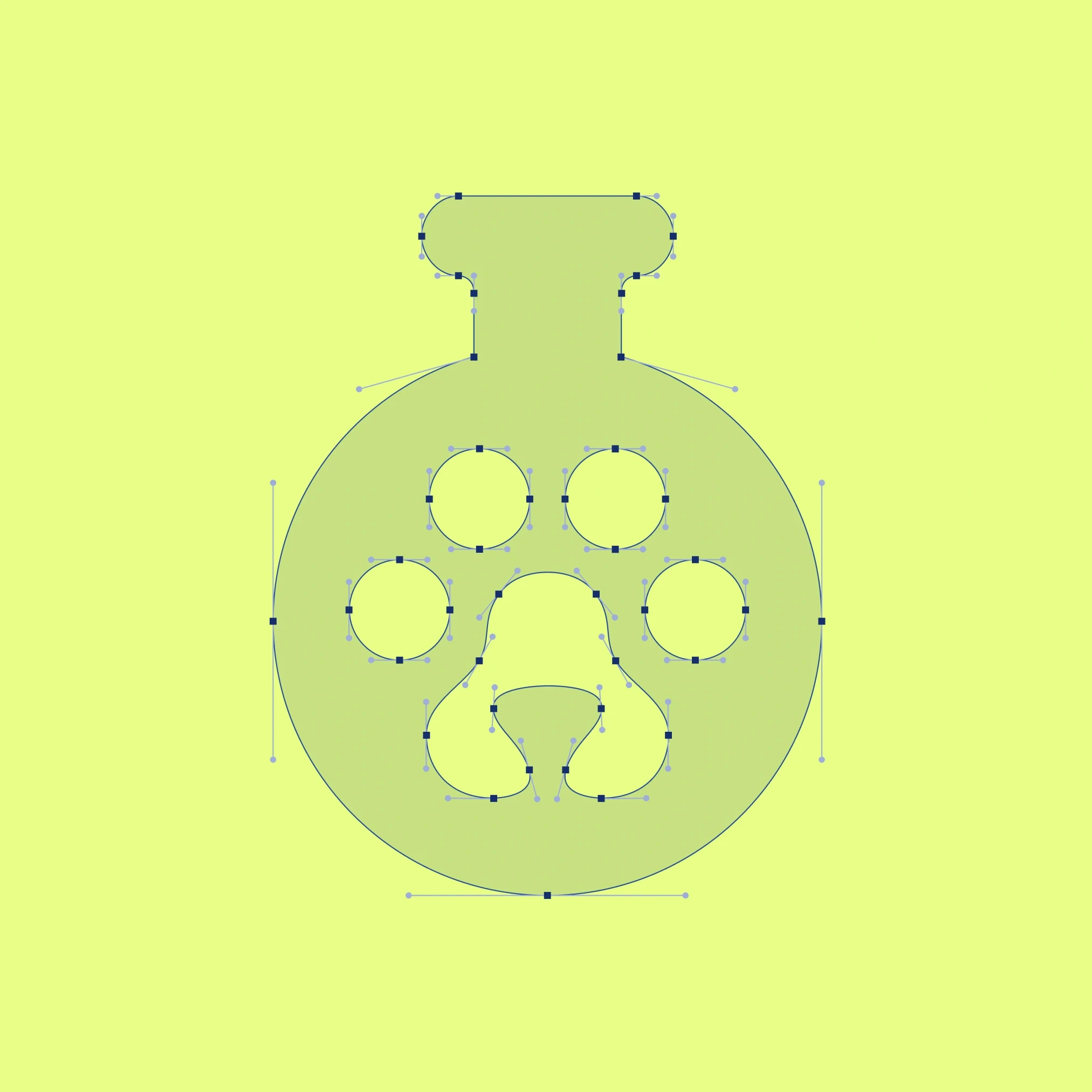
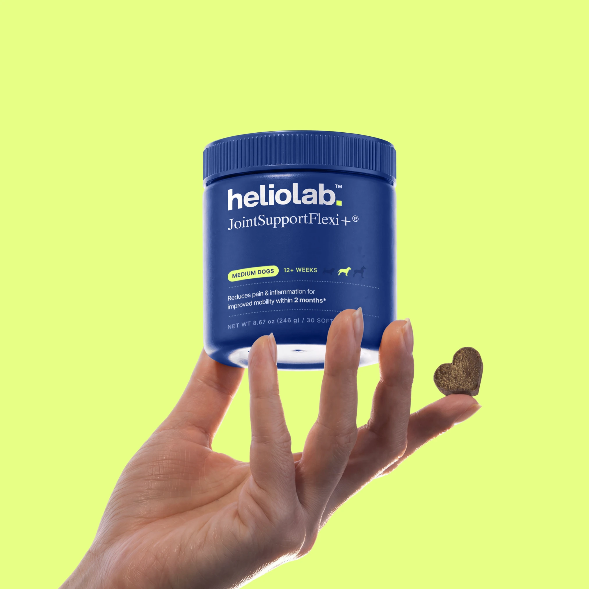
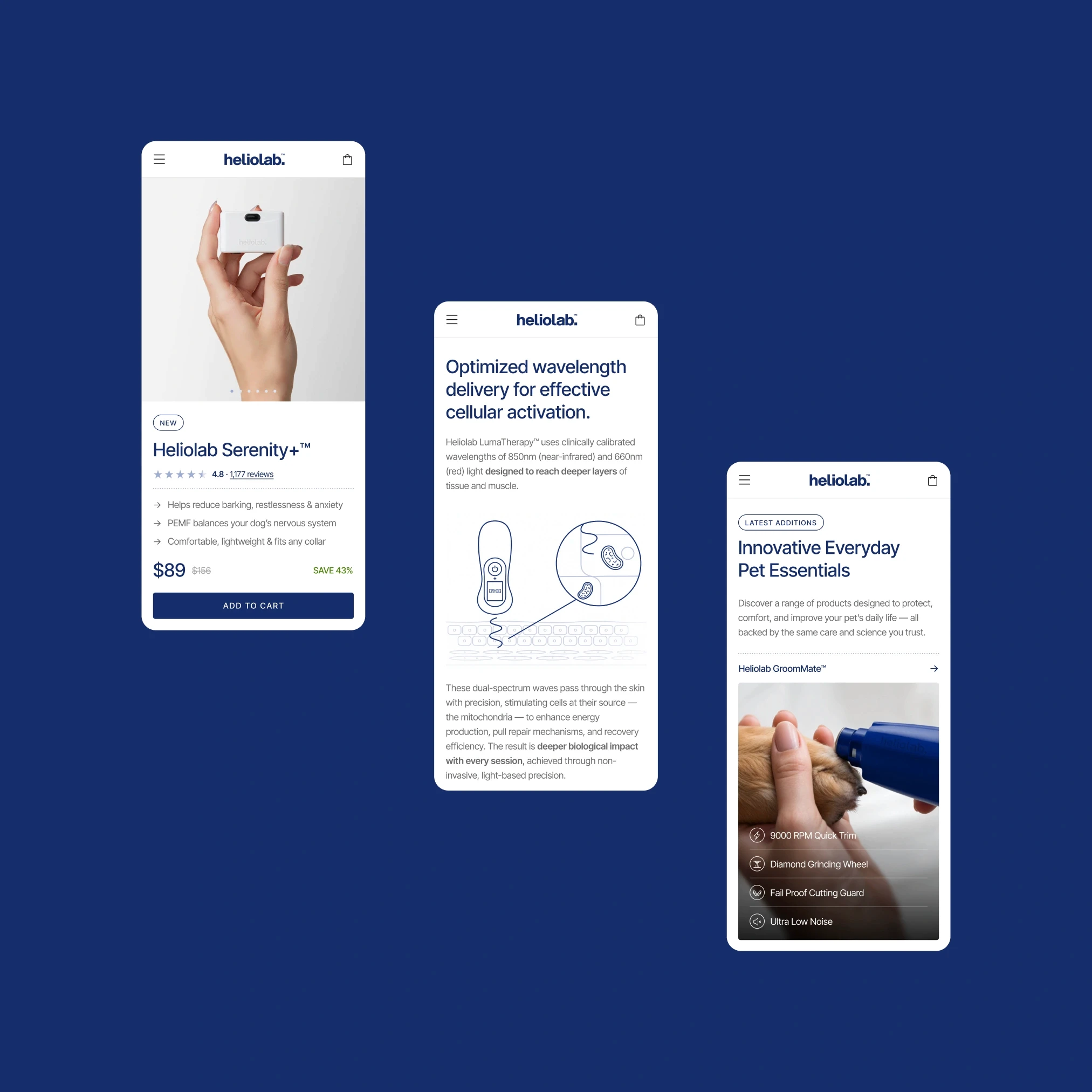
Brand designed for people who approach health decisions thoughtfully, especially as their pets age. The challenge was to create an experience that feels trustworthy without becoming clinical, emotional without feeling manipulative, and clear enough for a predominantly 50+ audience. The website is structured around confident, low-friction decision-making. Product information, comparisons, and educational content are organized in a simple hierarchy, with generous spacing, clear language, and restrained interaction helping users move through complex information without feeling overwhelmed. The visual system supports that clarity through deep, saturated blues, strong contrast, and controlled use of space. The name combines Helio - light and energy - with Lab, suggesting research and care, while the identity stays expressive but restrained so the product, message, and user journey remain the focus.

HLB_01.JPG
HLB_02.MP4
HLB_03.JPG

HLB_04.JPG
HLB_05.JPG

HLB_06.JPG
HLB_07.MP4

HLB_08.JPG
HLB_09.MP4
HLB_010.JPG

HLB_11.JPG

HLB_12.JPG
Heliolab
,
Pet Wellness
,
2026
Brand designed for people who approach health decisions thoughtfully, especially as their pets age. The challenge was to create an experience that feels trustworthy without becoming clinical, emotional without feeling manipulative, and clear enough for a predominantly 50+ audience. The website is structured around confident, low-friction decision-making. Product information, comparisons, and educational content are organized in a simple hierarchy, with generous spacing, clear language, and restrained interaction helping users move through complex information without feeling overwhelmed. The visual system supports that clarity through deep, saturated blues, strong contrast, and controlled use of space. The name combines Helio - light and energy - with Lab, suggesting research and care, while the identity stays expressive but restrained so the product, message, and user journey remain the focus.
HLB_01.JPG
HLB_02.MP4
HLB_03.JPG
HLB_04.JPG
HLB_05.JPG
HLB_06.JPG
HLB_07.MP4
HLB_08.JPG
HLB_09.MP4
HLB_010.JPG
HLB_11.JPG
HLB_12.JPG
Genesis
,
Health & Longevity
,
2026
Longevity and healthspan platform built to make advanced diagnostics, biomarker data, and preventive care feel easier to understand and act on. The challenge was to present a highly technical subject with enough scientific credibility to build trust, while keeping the experience calm, human, and accessible rather than dense or clinical. The website is structured around education, assessment, and ongoing guidance. Complex health information is broken into clear layers, supported by comparison tables, service pathways, research content, and concise explanations that help users understand what is being measured, why it matters, and what comes next. The interface keeps the reading experience light through strong hierarchy, generous spacing, and restrained interaction. The visual system brings together scientific precision and a softer sense of wellbeing. Deep teal, lilac accents, microscopy-inspired imagery, and circular forms create continuity across the experience, while clean typography and controlled gradients keep the system contemporary without becoming overly futuristic. The result is a digital presence that feels credible, clear, and reassuring - giving complex health information room to breathe.

GE_01.JPG
GE_02.MP4

GE_03.JPG

GE_04.JPG
GE_05.MP4

GE_06.JPG

GE_07.JPG
GE_08.MP4
GE_09.MP4

GE_10.JPG
GE_11.MP4

GE_12.JPG
Genesis
,
Health & Longevity
,
2026
Longevity and healthspan platform built to make advanced diagnostics, biomarker data, and preventive care feel easier to understand and act on. The challenge was to present a highly technical subject with enough scientific credibility to build trust, while keeping the experience calm, human, and accessible rather than dense or clinical. The website is structured around education, assessment, and ongoing guidance. Complex health information is broken into clear layers, supported by comparison tables, service pathways, research content, and concise explanations that help users understand what is being measured, why it matters, and what comes next. The interface keeps the reading experience light through strong hierarchy, generous spacing, and restrained interaction. The visual system brings together scientific precision and a softer sense of wellbeing. Deep teal, lilac accents, microscopy-inspired imagery, and circular forms create continuity across the experience, while clean typography and controlled gradients keep the system contemporary without becoming overly futuristic. The result is a digital presence that feels credible, clear, and reassuring - giving complex health information room to breathe.
GE_01.JPG
GE_02.MP4
GE_03.JPG
GE_04.JPG
GE_05.MP4
GE_06.JPG
GE_07.JPG
GE_08.MP4
GE_09.MP4
GE_10.JPG
GE_11.MP4
GE_12.JPG
Seven Sharp Nine
,
Education
,
2026
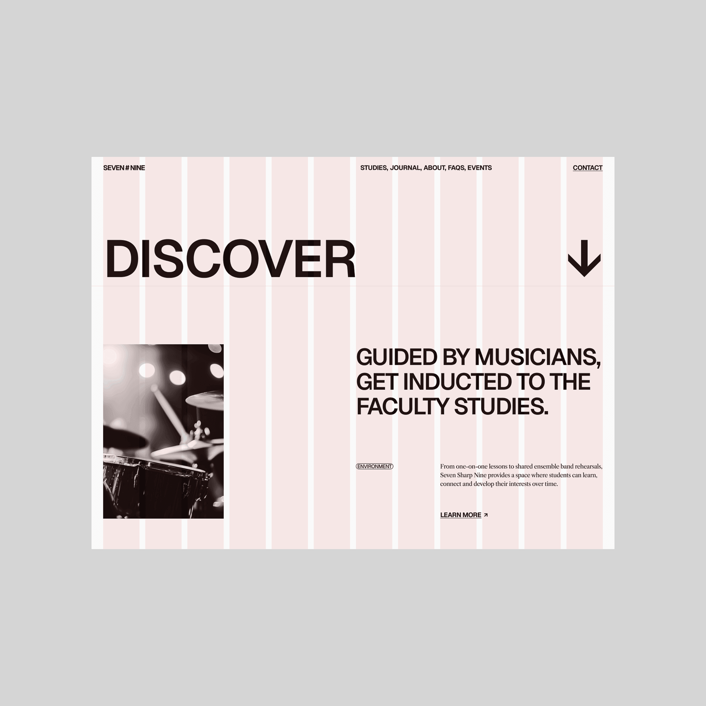
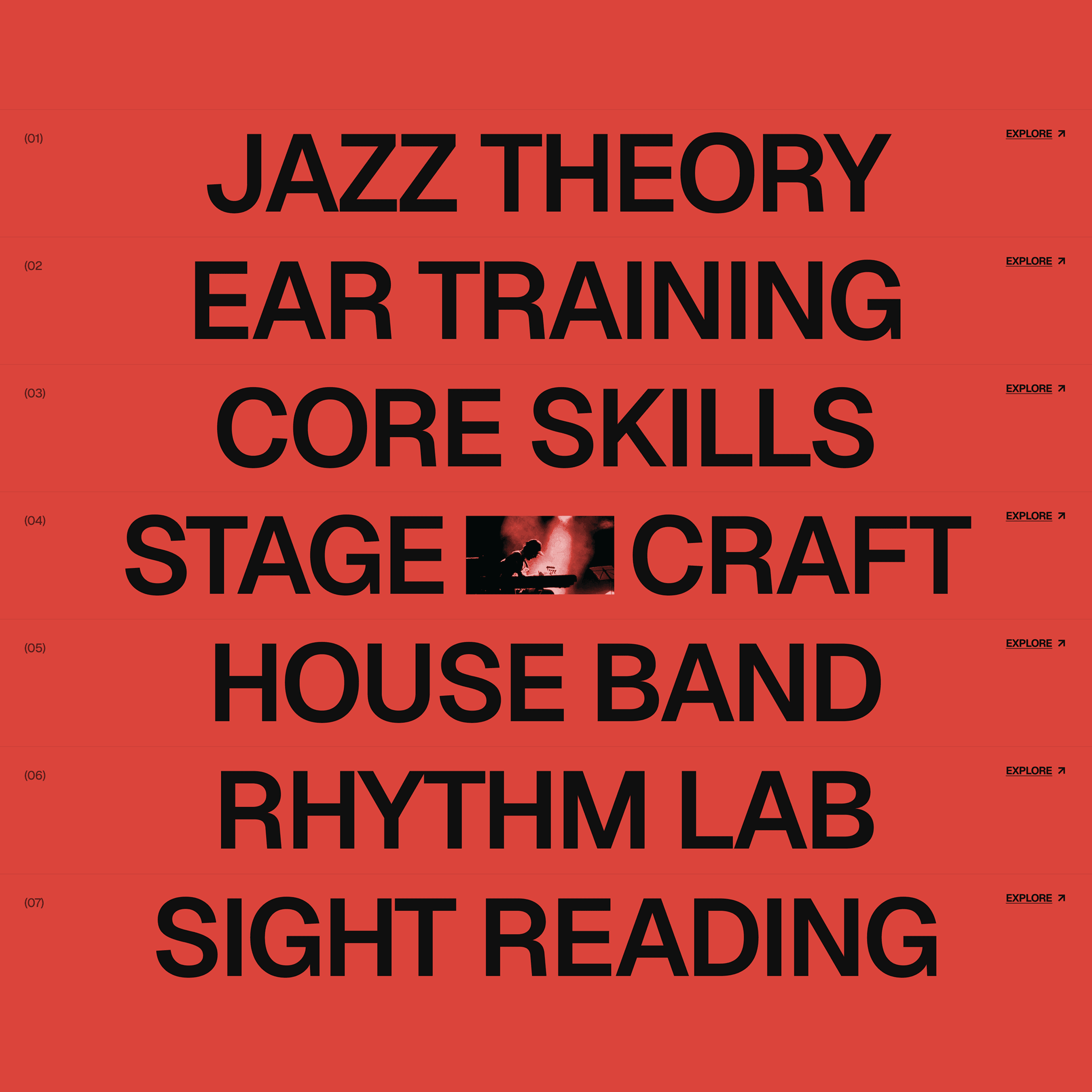
Seven Sharp Nine was designed to feel closer to a living music scene than a conventional school. The challenge was to give the programme structure and credibility while preserving the energy, personality, and immediacy associated with jazz. The website uses a strong editorial grid, oversized typography, clear navigation, and modular content blocks to organize studies, masterclasses, faculty, events, and supporting information. The structure keeps dense educational content easy to scan, while photography and selective motion bring rhythm and variation into the experience without compromising clarity. The visual system takes cues from jazz itself - contrast, repetition, improvisation, and structure. A restrained black, white, and red palette gives the identity immediacy, while bold typography, modular layouts, and documentary-style imagery create a system that can shift between expressive and functional depending on the content.
7#9_01.MP4

7#9_02.JPG
7#9_03.MP4

7#9_04.JPG
7#9_05.MP4
7#9_06.MP4
7#9_07.JPG
7#9_08.MP4

7#9_09.JPG

7#9_10.JPG

7#9_11.JPG
7#9_12.JPG
Seven Sharp Nine
,
Education
,
2026
Seven Sharp Nine was designed to feel closer to a living music scene than a conventional school. The challenge was to give the programme structure and credibility while preserving the energy, personality, and immediacy associated with jazz. The website uses a strong editorial grid, oversized typography, clear navigation, and modular content blocks to organize studies, masterclasses, faculty, events, and supporting information. The structure keeps dense educational content easy to scan, while photography and selective motion bring rhythm and variation into the experience without compromising clarity. The visual system takes cues from jazz itself - contrast, repetition, improvisation, and structure. A restrained black, white, and red palette gives the identity immediacy, while bold typography, modular layouts, and documentary-style imagery create a system that can shift between expressive and functional depending on the content.
7#9_01.MP4
7#9_02.JPG
7#9_03.MP4
7#9_04.JPG
7#9_05.MP4
7#9_06.MP4
7#9_07.JPG
7#9_08.MP4
7#9_09.JPG
7#9_10.JPG
7#9_11.JPG
7#9_12.JPG
Avenir
,
Consulting
,
2026
Avenir is a consulting and advisory brand built for organizations navigating growth, change, and complex decisions. The challenge was to create a digital presence that feels established and credible without falling into the rigid, overly corporate language common in professional services - giving the company enough authority while still feeling contemporary and approachable. The website is structured to move naturally between expertise, proof, and perspective. Services are broken into clear areas, while case studies, measurable outcomes, client perspectives, and editorial content add context and credibility throughout the experience. A modular layout system allows information-dense sections to remain easy to scan while giving each page enough variation to feel purposeful rather than repetitive. The visual direction balances restraint with character through deep navy tones, pale blue accents, editorial typography, and a recurring circular motif that brings continuity across the system. Documentary-style photography and subtle data-driven elements add a human and contemporary layer, creating an experience that feels confident and considered without becoming overly polished or impersonal.

AV_01.JPG
AV_02.MP4

AV_03.JPG

AV_04.JPG
AV_05.MP4

AV_06.JPG

AV_07.JPG

AV_08.JPG

AV_09.JPG

AV_10.JPG
AV_11.MP4

AV_12.JPG
Avenir
,
Consulting
,
2026
Avenir is a consulting and advisory brand built for organizations navigating growth, change, and complex decisions. The challenge was to create a digital presence that feels established and credible without falling into the rigid, overly corporate language common in professional services - giving the company enough authority while still feeling contemporary and approachable. The website is structured to move naturally between expertise, proof, and perspective. Services are broken into clear areas, while case studies, measurable outcomes, client perspectives, and editorial content add context and credibility throughout the experience. A modular layout system allows information-dense sections to remain easy to scan while giving each page enough variation to feel purposeful rather than repetitive. The visual direction balances restraint with character through deep navy tones, pale blue accents, editorial typography, and a recurring circular motif that brings continuity across the system. Documentary-style photography and subtle data-driven elements add a human and contemporary layer, creating an experience that feels confident and considered without becoming overly polished or impersonal.
AV_01.JPG
AV_02.MP4
AV_03.JPG
AV_04.JPG
AV_05.MP4
AV_06.JPG
AV_07.JPG
AV_08.JPG
AV_09.JPG
AV_10.JPG
AV_11.MP4
AV_12.JPG
Mindly
,
Sleep Technology
,
2025
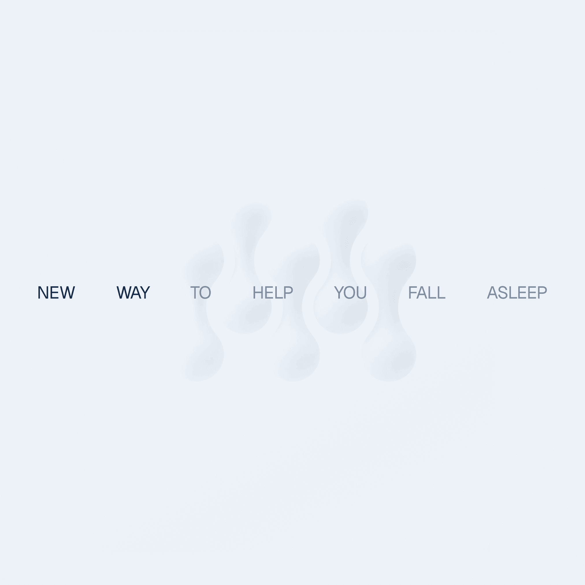
Mindly is a sleep and recovery brand exploring how technology can support the body’s natural rhythms rather than override them. The challenge was to make topics such as nervous system regulation, PEMF technology, and circadian health feel credible, understandable, and approachable without falling into either clinical coldness or generic wellness aesthetics. The digital experience was structured around three layers: product, education, and personal insight. Clear hierarchy, generous spacing, restrained use of color, and simplified content blocks help users move between science, benefits, and product information without cognitive overload. The mobile experience follows the same logic, translating sleep data and recovery patterns into calm, readable visualizations. Visually, the direction moves away from the dark, dreamy language common in sleep brands. High contrast, white space, and controlled blue tones create a cleaner and more contemporary experience, while softer forms and subtle graphic elements keep the system from feeling clinical. The identity supports the digital experience rather than competing with it.

MN_01.JPG
MN_02.MP4

MN_03.JPG
MN_04.JPG

MN_05.JPG

MN_06.JPG

MN_07.JPG
MN_08.MP4

MN_09.JPG

MN_10.JPG
MN_11.MP4

MN_12.JPG
Mindly
,
Sleep Technology
,
2025
Mindly is a sleep and recovery brand exploring how technology can support the body’s natural rhythms rather than override them. The challenge was to make topics such as nervous system regulation, PEMF technology, and circadian health feel credible, understandable, and approachable without falling into either clinical coldness or generic wellness aesthetics. The digital experience was structured around three layers: product, education, and personal insight. Clear hierarchy, generous spacing, restrained use of color, and simplified content blocks help users move between science, benefits, and product information without cognitive overload. The mobile experience follows the same logic, translating sleep data and recovery patterns into calm, readable visualizations. Visually, the direction moves away from the dark, dreamy language common in sleep brands. High contrast, white space, and controlled blue tones create a cleaner and more contemporary experience, while softer forms and subtle graphic elements keep the system from feeling clinical. The identity supports the digital experience rather than competing with it.
MN_01.JPG
MN_02.MP4
MN_03.JPG
MN_04.JPG
MN_05.JPG
MN_06.JPG
MN_07.JPG
MN_08.MP4
MN_09.JPG
MN_10.JPG
MN_11.MP4
MN_12.JPG
Neokinetika
,
Healthcare
,
2025
Neokinetika is a rehabilitation clinic focused on modern manual therapy and recovery. The project marked a transition from an established practice into a more independent and contemporary presence, with the challenge of communicating clinical expertise in a way that feels trustworthy, confident, and human rather than traditionally medical. The website was designed around services, team credibility, and a clear path to booking. Simple information hierarchy, generous spacing, and restrained interaction keep the experience easy to navigate, while the typography and content structure make treatment information approachable across devices. The result feels calm and considered without sacrificing clarity or professionalism. The visual system takes movement as its central principle. Organic linear forms reference fascia fibers and hands-on therapy, while deep blues provide stability and softer gradients introduce depth and warmth. Subtle texture adds tactility to an otherwise precise system, balancing the clinical nature of the practice with the physical, human character of the treatment itself.

NEO_01.JPG
NEO_02.MP4

NEO_03.JPG

NEO_04.JPG

NEO_05.JPG

NEO_06.JPG

NEO_07.JPG

NEO_08.JPG

NEO_09.JPG
NEO_10.MP4

NEO_11.JPG

NEO_12.JPG
Neokinetika
,
Healthcare
,
2025
Neokinetika is a rehabilitation clinic focused on modern manual therapy and recovery. The project marked a transition from an established practice into a more independent and contemporary presence, with the challenge of communicating clinical expertise in a way that feels trustworthy, confident, and human rather than traditionally medical. The website was designed around services, team credibility, and a clear path to booking. Simple information hierarchy, generous spacing, and restrained interaction keep the experience easy to navigate, while the typography and content structure make treatment information approachable across devices. The result feels calm and considered without sacrificing clarity or professionalism. The visual system takes movement as its central principle. Organic linear forms reference fascia fibers and hands-on therapy, while deep blues provide stability and softer gradients introduce depth and warmth. Subtle texture adds tactility to an otherwise precise system, balancing the clinical nature of the practice with the physical, human character of the treatment itself.
NEO_01.JPG
NEO_02.MP4
NEO_03.JPG
NEO_04.JPG
NEO_05.JPG
NEO_06.JPG
NEO_07.JPG
NEO_08.JPG
NEO_09.JPG
NEO_10.MP4
NEO_11.JPG
NEO_12.JPG